Frightening Experiments 1: Recluse Tech (complevel 21)
-
Had to put out another bugfix because i apparently forgot in a duplicate midi in the wad overriding d_runnin. Sorry!!
-
@MattFright
Here is another map I made for the project. It’s in the map 3 slot
https://drive.google.com/file/d/1VS71EWA_Mcqa_bb1yGBF4xNZ9rmiY1sJ/view?usp=drivesdkI also took your feedback and changed map 10. Here is the updated version
https://drive.google.com/file/d/1qtnIeaxZT48KJoRtH7mqNMVGImG_1yY5/view?usp=drivesdkThanks!
-
For future reference, i created a trello to better keep track of who's working on what and w/e since not everyone is active in the forum: https://trello.com/b/GCRHKhdr/recluse-tech
Also updated the OP to include the link, of course
-
@TripleGenesis I tried to download your maps, but Google is saying I need to request access to view them. Could you make them available so I can do a recorded playthrough?
-
@Large-Cat He told me in DMs he was updating them again and for me to not check them out yet so that might've been it (maybe he should've edited his post to clarify it :p)
-
@MattFright I know you said MAP02 is "finished and tested" in the Trello, but I figured I'd provide a demo anyway, in case it sheds any insight; I'm playing through other submissions to get a feel for the resources. Recorded on UV in DSDA Doom (-complevel 21) using fe1_v3.2.wad.
I think there are three major things to note here:
- It seems the cyber/AV fight can be cheesed to some degree: the lock-in bars don't raise very quickly, so it's pretty simple to run past them right after hitting the triple key button. Given that the player isn't locked in on the other side, this may not be a big deal.
- The railings around the bottom of the south stairs up to the cyber/AV arena don't appear to block anything, so it's possible to go careening off into the OoB area, as I do in my demo.
- The mancubi guarding the SSG don't seem to pop up. It looks like no lines have tag 143 to raise them.
Other than that, I had a good time with the map, and the combat pieces were enjoyable. If this is MAP02, the difficulty of the WAD seems like it will end up well above Doom 2, closer to Valiant level. I especially enjoyed the use of longer range monsters at several angles when entering into the yellow key area.
The map has a very consistent visual theme, which is a double-edged sword. On the plus side, it creates a unified experience. On the minus side, navigation was tricky for me at several points, exacerbated by two other factors: the crowded automap and the use of teleporters to link the key arenas to the hub. I don't have simple fixes for any of this, and it doesn't ruin the experience by any means. I will say the green key wing was the most visually/structurally striking and memorable outdoor area for me. The blue key was my favorite indoor arena.
On the whole, the map is on the longer side, taking 30-40 minutes on a blind playthrough, but it's likely someone with better foreknowledge could blast through it more quickly.
I'll start looking at putting together a submission of my own. I'll at least be starting with something short and snappy. After that, I may implement a more involved idea that I think will fit this theme nicely.
-
Thanks for the demo @Large-Cat !! I just finished watching it. Nobody recorded a demo for a while so i had no idea to know how people were actually playing it just yet, so this was extremely helpful. I definitely found even more to fix than you probably thought

I'll probably also be making a few major fights harder since they're apparently trivial if you have any of the secrets at the time, and leave this current setting for skill 2 or 3.
I know you said MAP02 is "finished and tested" in the Trello, but I figured I'd provide a demo anyway
I think i'll just edit it to "Submitted" and do that for any future submissions, indeed no point to just assume there's no issues with it (especially when there are :p)
If this is MAP02, the difficulty of the WAD seems like it will end up well above Doom 2, closer to Valiant level.
I only put it on slot 2 so people wouldn't default to creating a map01 and have it crash. Slots will only be decided when everyone's submitted their maps!
the crowded automap
I wish the demo recorded the input of you opening the automap so i could see when you looked at it... Either way this could be an easy fix, i really didn't put much effort into fixing that at all (working on a map this big makes you forget even the most basic things). Consider it done before release though!
I'll start looking at putting together a submission of my own. I'll at least be starting with something short and snappy. After that, I may implement a more involved idea that I think will fit this theme nicely.
I'm looking forward to it

-
Attention, all! We're a little less than a month away from the deadline! I hope everyone's still working on finishing up their maps


Also started working a 2nd map!! I feel like the amount of vegetation just makes me too slow at it as much as i even wanted to have 3 whole maps finished for the project... Oh well, at least these two i have now are turning out exceptionally well.
Also, i just updated the resources to V3.3. Nothing special, just some fixes, an update to my sample map with some gameplay changes and fixes, and probably minor things i'm forgetting about.
Here's a download link. -
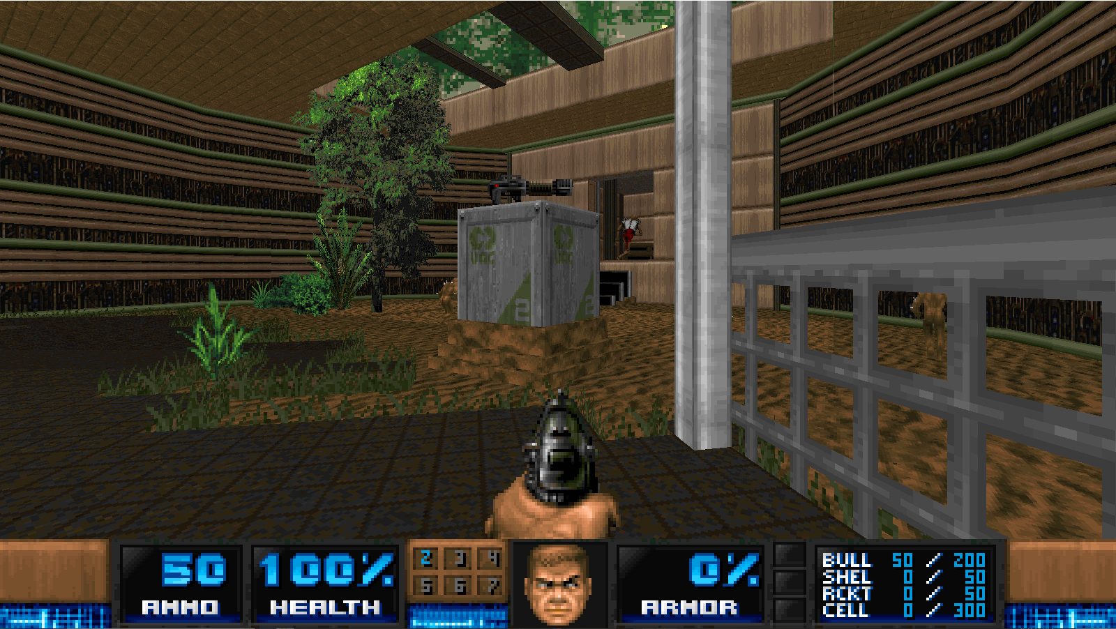
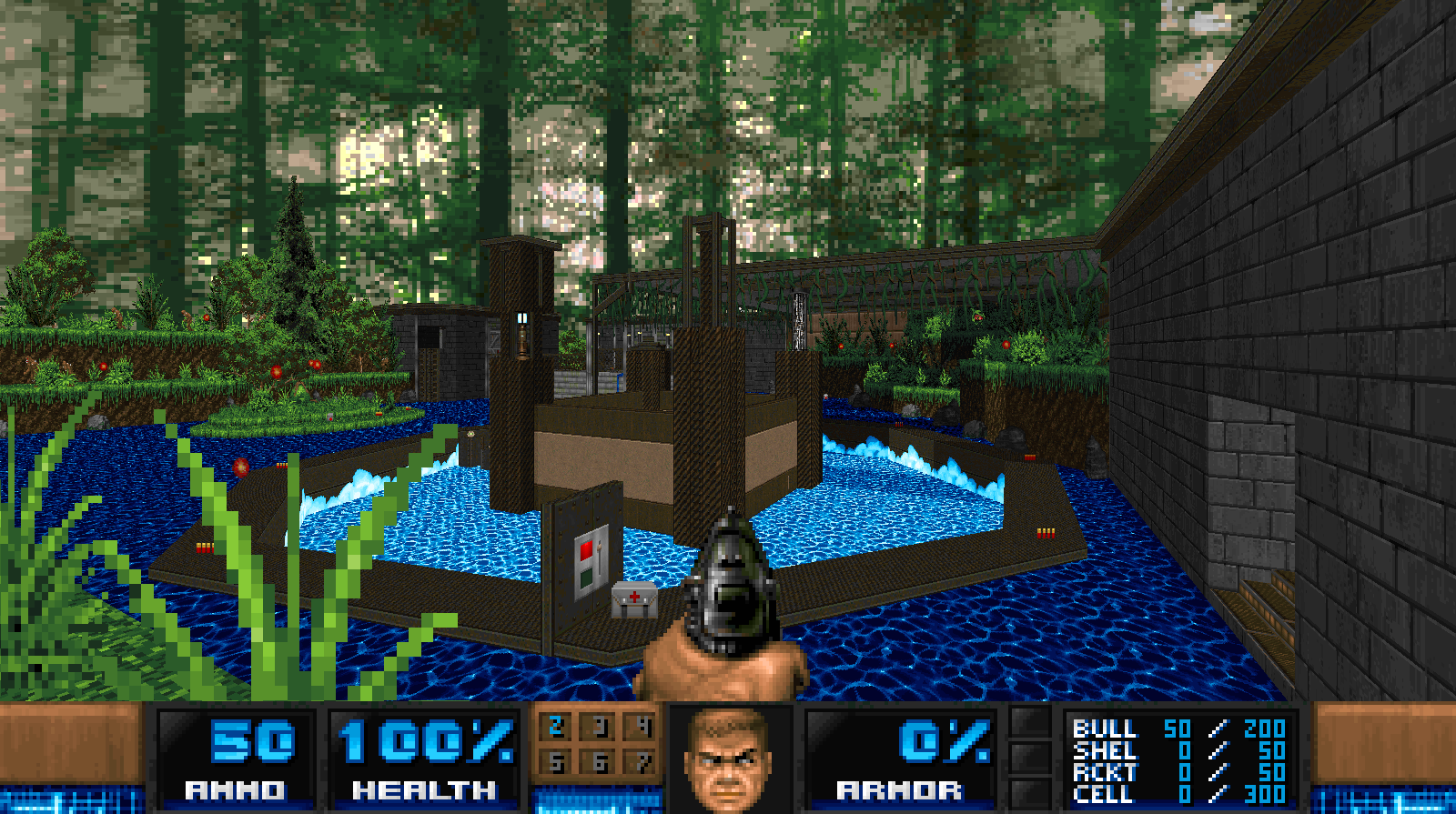
Some nice-looking shots! I have minimal experience building techbases, so hopefully I'll learn how to make some good techy visuals over these two months. I've got my own map making good progress; we'll see whether that sceond map I mentioned materializes in the next few weeks.
@MattFright Quick note about the status bar: I recall you saying that this project was focusing on/tested with OpenGL. I normally play with software rendering, and I noticed a software-specific bug with the numbers on the status bar:

It's almost like there is a minor HOM-like effect that appears when the numbers change; you can still see the remnants of the leading 2 in the attached pic. This bug doesn't appear in OpenGL. Just wanted to make you aware in case you wanted to fix it for the software players out there. -
@Large-Cat said in Frightening Experiments 1: Recluse Tech (complevel 21):
Quick note about the status bar: I recall you saying that this project was focusing on/tested with OpenGL
Not at all! I actually don't know where you got that from (maybe a recommendation about this bug specifically?), i do also prefer and almost always play on Software. The statusbar issue is an issue specific to DSDA's and Woof's Software renderers specifically, other ports render them correctly regardless of renderer. The only reason i didn't account for it is that it's getting fixed on both ports in their next update.
-
Finally put together a map. A second, more incidental and less intense map is in the works; we'll see whether I can get it done in the next two weeks.
Title: Clover
Slot: MAP04
MIDI: whatever was in MAP04 in the resource
Difficulties: not implemented
Multiplayer stuff: none
Playtime: 10-15 minutes to 100%The goal here was something shortish and explosive, and I feel like I succeeded, though feedback is always welcome (especially demos or playthrough vids). The difficulty level sits on the upper side of the target window, around Ancient Aliens on UV.
Be warned: the final wave has a tendency to devolve into insanity, so I am considering adding a BFG there to make it less dangerous. It's still beatable currently, but hard to be consistent. I didn't want to add a BFG because that really limits the slots a map can occupy in continuous play, but a BFG does feel like a natural final reward here. I could also thin the horde a bit, or add some delay so you don't get dogpiled.
Some screenies:
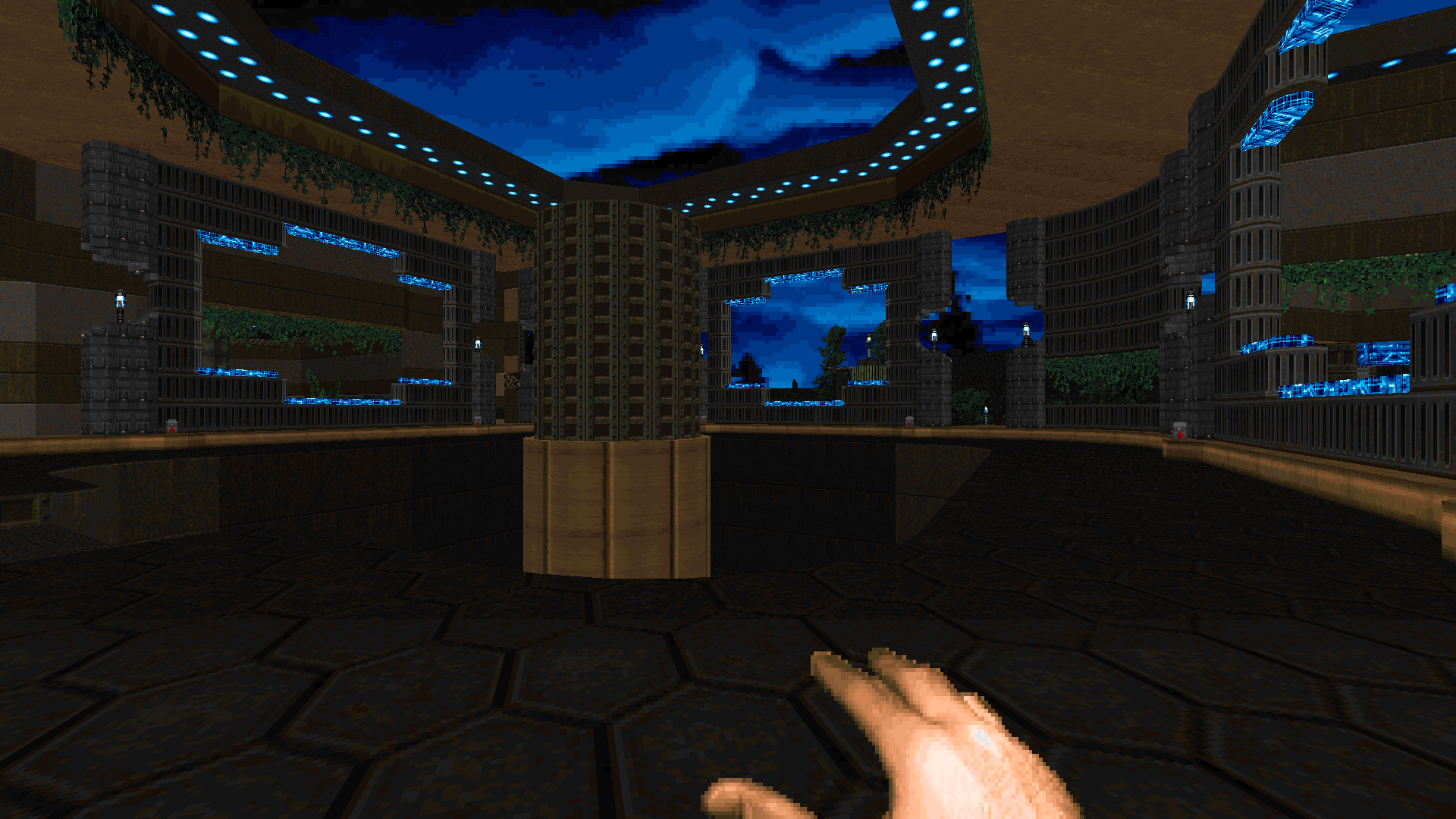
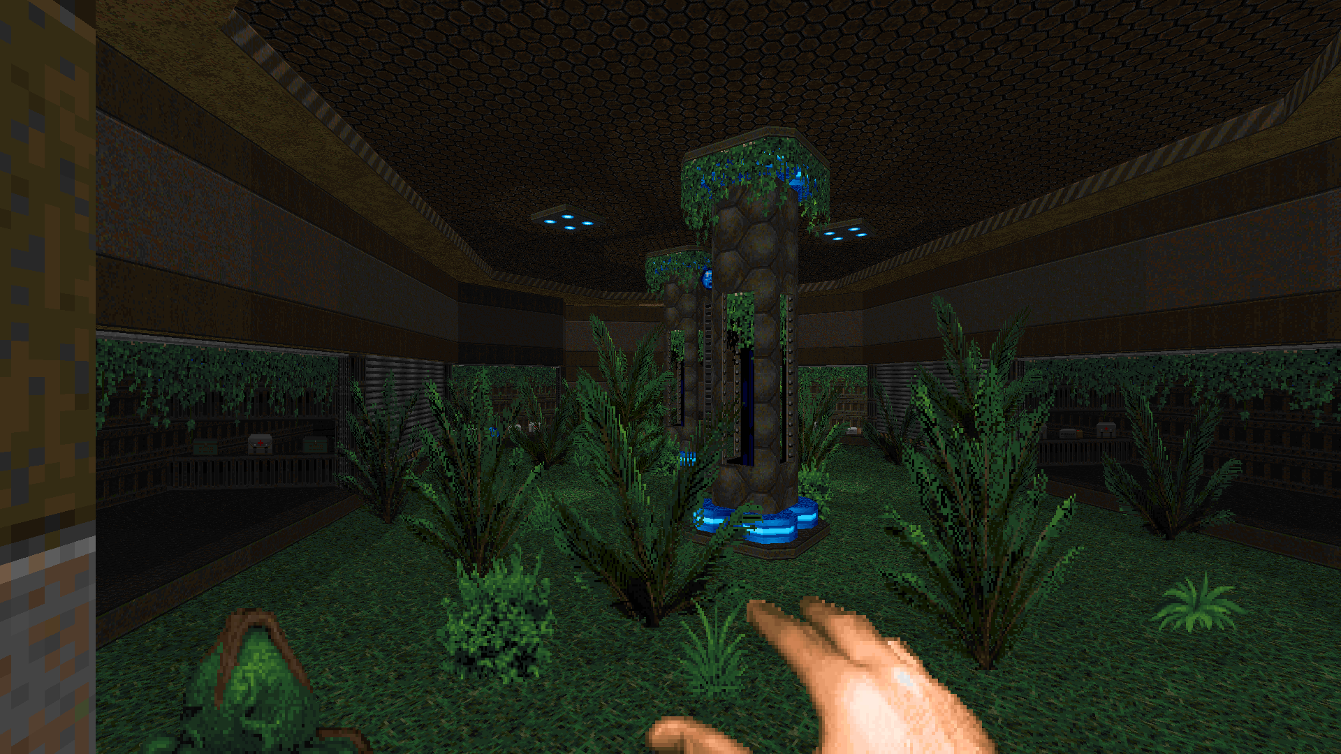
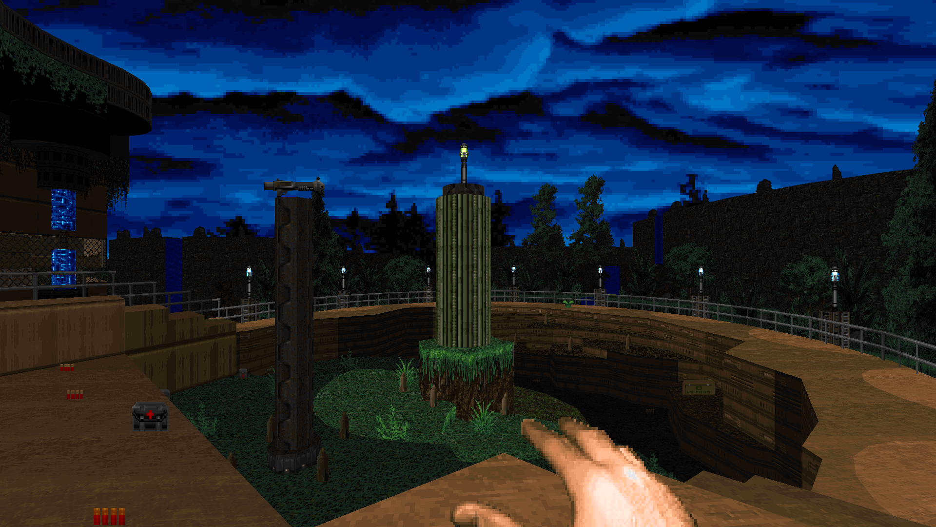
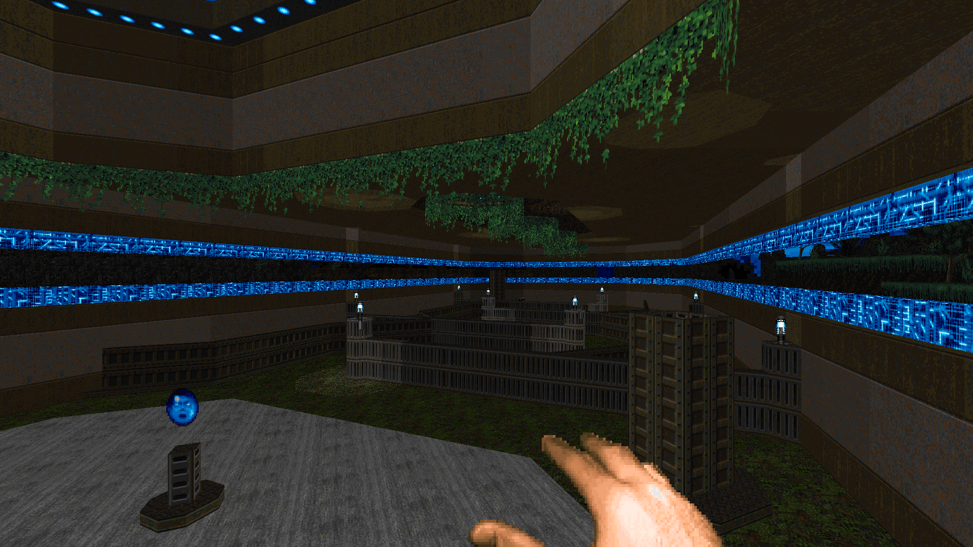
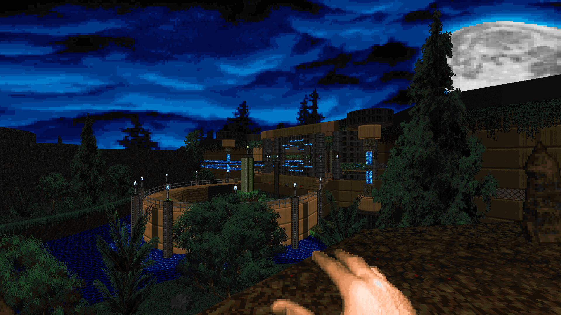
-
Hey ya'll! New mapper here, and I thought I'd try my hand at making something for this project!
Here's a simple, early game map that focuses on introducing the new hazard monsters and giving the player a nice end-fight to flex their rocket launcher skills. Feedback is appreciated! Looking at some of the screenshots provided here I can already see myself hopping back in and adding some more details... -
@hotdogkirby said in Frightening Experiments 1: Recluse Tech (complevel 21):
Here's a simple, early game map that focuses on introducing the new hazard monsters and giving the player a nice end-fight to flex their rocket launcher skills.
Played through your map, here's my FDA: resimps.lmp
Recorded using DSDA Doom (-complevel 21).I think you hit one of your stated goals: the map offers very little resistance, and I am never in any real danger. If you're not paying attention, you could take some surprise fireballs or face-rocket yourself in the final throwdown, but if you're taking any care, it's no problem. I'll let you watch the demo to determine whether I am approaching your fights in ways you find agreeable. If you wanted to pump the difficulty, you could implement the current setting as HMP or HNTR and throw in some further curveballs on UV.
As for introducing the hazards, I think your rocket launcher shooting range does a nice job showing the player that the bulbs are shootable; I think you could even go further, adding more bulbs and imps to make it clearer that the bulbs are damaging imps. I think the sour blossoms could use more direct attention when "introduced," as both the blossoms here are a bit hidden and out of the way. Then again, we could have MAP02 or 03 provide a stronger introductory gimmick for the blossoms.
Visually, you have some nice elements, and the geometry of the start crossing through the final arena is very nice. It does seem like this outdoor area got the lion's share of your attention, so if you add more detailing, I think you would get better mileage out of details in the middle leg of the map, where some rooms seem a little more bare compared to the delights of the final zone.
Good stuff! This map could make a nice opener, being delightful and thematic on visuals and geometry, agreeable on difficulty, and making some introduction of the custom monsters. We'll see how things slot into place.
-
@Large-Cat Just finished playing your map, here's a (very long) demo.
On my first run you could see i was doing super well and actually was having a ton of fun, though after the first death is where i started seeing a few issues. I'll try to make a concise list:
-The zombiemen at the start feel like nothing but a health tax and, after your first run, they start feeling like a waste of time (especially combined with the lift which isn't quite fast enough).
-There's a bit too much going on when you get off the lift at the top of the pit. I feel like it'd feel a lot better to give you a Super Shotgun (not even a regular shotgun, more on that later) when getting on the lift, or just not have so many tanky high DPS enemies at the start (shotgunners are definitely a huge unnecessary health tax on top of the one with the zombiemen in the pit). I don't think this would even break the plasma fight setup because you wouldn't have the time or space to think you can stay and fight at the start.
-The cyberdemon is a brilliant part of this map, and while i felt like the map was way too hard it was due to inconveniences and grind that i'll point out below. If you watch my demo you'll see i eventually figured it'd be more beneficial to just get rid of the cyberdemon, but i think with tweaks to make the rest of the map less frustrating i wouldn't feel such an urge to get rid of him early.
-The map is beautiful (especially the outside area) and i do really like the general layout, though i feel like a lot of the things you should be paying attention to look a bit too dull and so you end up focusing on cosmetic details and missing core gameplay aspects of arenas. Like how you can see in my demo that i took forever to realize the chaingun arena even existed since the doorway to it is so desaturated and relatively dark comparing to the rest of the hub. Maybe add some light sequences or armor/health bonuses to help with this?
-I actually couldn't tell what the switch at the end of the corridors of the chaingun timed fight did, apart from spawning pretty undodgeable revenants. I did not like fighting them in such a cramped hallway, felt very clunky and claustrophobic.
-As for the arena of that area itself, you really should just have a chaingun on a pedestal and a LOT of bullets around. The shotgun is pretty useless for that fight (even the SSG would be a bit too sluggish for the fight if you added it).
-The sour blossoms in that arena didn't really do much of anything, i think putting them closer to the center (maybe even using the angry ones??) could make the fight a lot more fun and make it flow faster as well as helping a lot with the issue of running out of ammo so easily, since you'd be able to use them to harm the demons.
-The rocket launcher area feels really wrong. I don't think there's anything wrong with the layout itself, but there's way too many enemies, way too many tanky enemies, the revenants are definitely a bit too much and it's very unclear how to get the RL (would be a lot better to just make it lower by switch or already place it close to the ground). As for the enemies, maybe just leave very few in there and make a few (hopefully not too tanky) enemies spawn in? You could play around with it, but do try to avoid putting too many enemies spread around everywhere, since that made it feel way too claustrophobic and unfun to run through.
-The plasma fight is honestly great and i feel like the only issues i have with it are the archvile at the end (feels extremely unfair as it is usually just a guaranteed zap and your soulsphere gone) and waaaay too many tanky enemies. I think you could easily do with no hellknights and just pinkies and the archvile at the start.
-The switches on the plasma fight are also a little too low on the ground, so it's extremely easy to not see them or not be able to see what state they're in, and also really easy to just climb them by accident making it extremely difficult to press them in a haste. You could put them on 16 or 24 tall small little platforms and make those block players, that would fix all these issues i think.
-The lift to the switch for the final fight is a little unnecessarily deadly. I think you could do with pushing it in a little further to make it harder to catch a stray rocket and remove the pinkies (or just place them as ambush near the switch).
-I do also support the idea of adding a BFG for the final fight, as i honestly can't really see how you're supposed to fight that many enemies with just a rocket launcher and plasma rifle, especially if i didn't kill the cyberdemon.
-Maybe could add an invulnerability secret somewhere? I think it could be really good for a blind player to use to practice different parts of the level or to just use it on whatever of all 4 major fights they find to be the hardest. I think it could be a really fun addition! Up to you though.I actually can't comment on anything beyond this because i stopped playing, seeing that there were too many little problems stacked up making it very frustrating to get very far. Though i imagine that really was the final fight and opened up an exit...somewhere.
I hope i wasn't too harsh though, your map is really good and i'm sure with some tweak it can be extremely fun!! You just need to rebalance it around a bit so strategies are a lot more consistent and so that progression/combat can be a lot faster an snappier.
BiZ on my Discord server also recorded a demo and a txt file with thoughts on the map for you, he asked me to pass it along since he doesn't have an account on this forum:
clover_bizFDA-00002.lmp
clover_bizFDA-00003.lmp
message.txt -
@hotdogkirby Played through the map, here's a demo.
-It was very pretty, i especially loved how you did all the vegetation, it looked great.
-You could add some optional off-track armor in that pit near the bridge at the start, would help give that place some purpose and help with some of the issues i'll bring up below.
-The decorating around the sour blossom on the 2nd room was adorable.
-I thought the visual presentation of the rest of the room really odd, though. The door textures with all the monster sounds (which were overly loud btw, if they're just closets i recommend moving them much further away) made me think one of them somehow opened to another room or that there was going to be a deadly ambush, which gave the map a pretty conflicting feeling throughout.
-It happened so quick that i don't remember it exactly but i think you were using the same textures for doors that opened by pressing on them and for ones that you opened via external means. I strongly advise that you make those more visually distinct.
-In the next room there was a similar issue with a random wall using a lift texture. Very distracting and confusing.
-I feel like that little area with the imps and mancubus would benefit a lot from something making you actually stay there and fight, since it's extremely easy to just leave and pretend there weren't ever any monsters there. An easy fix would probably be to swap the mancubus for a pain elemental but of course you can try something else.
-In the next area, that brown tunnel, there's another issue of a red key door being used for its light decorations on a wall. This is probably the one that sounds most nitpicky but, for my next point:
-All these texture norms broken near the start made my brain interpret the layout as being way more linear than it was and by the end made me very confused, since seeing so many door textures at the start made me subconsciously think there was a whole lot more to the map and left my expectations a bit out of place.
-The shooting gallery was cool, though i feel like that weird wall in the middle didn't serve for much and just kinda made it look less nice than it could have, and the techbase part of that area at least could do with a little more detailing.
-I really like the idea of the bulbs being used there, though maybe having more of them could've made it more fun.
-Maybe having something else come behind you or cacos spawning and flying in to make for a bit more of a threat? as is, that area doesn't pose much of a challenge, and i don't know if that's intentional or not. Maybe could also make the imps hitscanners instead?? That would make you way more inclined to rush and shoot them down i bet.
-I really liked the whole setup of the last fight, but i think the pacing could've been better. I think the pacing would've been more pleasant if the arachno and mancubus teleported in after you grabbed the key
-I think the way it's set up there's nothing really stopping you from just rushing to the exit and ignoring the final fight. Could try to work out some timer or place a baron stuck in front of the exit switch.
-The exit sign was all the way back nowhere near close to the exit, i think it'd make a lot more sense to actually place it in front of the exit.
-That exit room could really use with some more detailing. It looks very barebones comparing to the whole rest of the map.That's a lot but i really liked your map!

-
Thank you both very much for the feedback! I really appreciate the in-depth reviews, it means a lot!

I hope no one minds me making one response for two different reviews, I just didn't want to clog the forum lolAs for the map itself, It seems like everyone's liked the core design so far, with most complaints being oddities with the visuals. I'll be the first to admit the map's middle section needs a visual touch up, which I'll be sure to tackle. On the other hand the main outside area seems to be considered a highlight, which I'm delighted to hear.
Otherwise my main focus is going to be tweaking the fight design. I must confess that I'm not a very good doom player, so balancing things in a way that is interesting for the player is something I tend to struggle with, however I've already cooked up some ideas to make the map a bit more challenging while still being a relatively tame opener.
I'll have your comments pulled up as I edit the map, so hopefully all your gripes will be addressed in some form or another, Can't wait to share the next build with everyone! -
I didn't say it right away because i didn't want the thread spammed all in the same day, but i'll announce that the deadline has been pushed back to November 1st! This is because many people have been struggling with their maps and i was worrying there would be a few too little maps. I might also take this opportunity to do a 3rd one.
I have also updated the resources with sour blossoms that don't projectiles and with an update of my map with all bugs hopefully fixed and some rebalancing thanks to all the testing i've got recently

-
Here's an update to my map, which I would now like to title "Lucky Clover":
There are quite a few changes, but I'll list some of the biggest ones:
- The starting pit now comes with a shotgun and green armor.
- Three of the "leaves" of the map now hold keycards which can be combined to access a BFG for the final onslaught.
- The rocket launcher arena now comes with an SSG to help pound the pinkies that rush you. Because the SSG so deeply outclasses the shotgun, I've throttled the shell supply to prevent the SSG from overshadowing the chaingun.
- The NE timed arena now has far more bullet ammo, essentially allowing the player to hold down the fire button.
- The plasma switchback has been jostled around to make it play more as intended, along with a new (unmarked) secret.
Thanks to @MattFright and BiZ for the demos and commentary! I don't think I addressed some of the suggestions in the lists you sent me, but I hope you'll trust me that any omissions have been made with some intention of vision, rather than out of negligence. Of course, if you really have strong feelings still, let me know; you are leading the project, after all.
Overall, I think postponing the deadline is a good call for me, at least. I'm working on a more exploratory/atmospheric second submission, which will naturally need some time to fill out and clean up, so I intend to put that extra time to good use!
-
This project makes me a bit nostalgic for the good ol' Skulltag days. Demos recorded in dsda-doom, hope I didn't miss any submissions.
@TripleGenesis Waiting for your new map update + download link
@hotdogkirby First here's your demo fe1-kirby.lmp
I like the clean looks of this map. Your switch where the chaingun is has some extra edges on the sides, and changing the texture on top of it would be nice too. As for the final fight maybe you'd want to put some monsters on top of the bridge too so you have some height dynamics there.@Large-Cat Did not finish. Here's your demo fe1-largecat.lmp but whenever you see me bumping around lost is when you should close it. I wanted to finish this map but I got stuck in the chaingun area and didn't know how to get out. Mildly peeved about not getting a zombieman double kill on the first enemies seen! Anyway this map looks pretty cool and the gameplay is more exciting and challenging. I first took the route to the berserk area, but I'm not sure how you intended the player to progress in the area because I punched all the initial enemies and found the plasma rifle at the end. So if you wanted me to get the plasma rifle then the enemy opposition was a bit too beefy for me to feel comfortable running past into the unknown. In the chaingun area I was able to kill enemies through some windows, which also looked pretty beefy. I think you could reduce the monster count and still achieve the same effects of the monsters used. Anyway I got stuck here and kept bouncing around and while doing so one of the monster closets opened so I assume I just skipped some triggers when entering? Switches could also use a new texture on top of them, nitpicky about switches today I suppose.
-
@Large-Cat Sorry it took me so long! I've been dealing with some personal issues on top of packing things up to move to a new house, so i haven't had the time to check it out until now. Here's a demo: mflargecatcloverdemo2.lmp
I hope this doesn't sound mean since you clearly tried but i feel like the issues i had with the map only got magnified, but let me start with the good:
-The SSG does definitely make me want to use the shells, even if still a bit rarely. I think you could get away with giving a few more shells and it wouldn't overshadow the chaingun much, though.
-The visual touch-ups are nice
-A proper weapon and armor to deal with all the stuff atop of the lift is greatly appreciated
-The chaingun encounter having an easy to get chaingun with plenty of ammo does probably make it better. I say probably because this run was way harder than my first, though most likely because i didn't get to kill the cyberdemon this time.Though there's where it ends, because i feel like a lot of the changes you made actually made a lot of the issues i had with the map a lot less pleasant.
-The addition of a BFG is nice but i feel like the addition of keys makes this map a lot more chaotic and probably way harder for a blind player to tell what's going on, with all the things they need to keep track of.
-The plasma encounter does indeed feel more clever with how the archviles are an actual threat, though this makes the issue of tanky enemies 10x worse, since not only are you spending a very long time just cleaning it all up, you're also having to deal with them constantly being revived and ending up with way less ammo.
-The rocket launcher should in theory be clearer how to get now, but the switch blends in too much with the grass and is very hard to notice when you're being bombarded by enemies that can kill you in one second if you stop moving, made even worse by the fact that that area is still too hard despite the addition of the SSG. That area specifically has way too much going on and could be made way more digestible.
-The chaingun area does also suffer from being too overwhelming, though only a little less so. It feels like it has almost every demon in the game and they're released one after the other, so on top of hitscan it feels like a bullet hell where you're also having to watch out for stray rockets and the sour blossoms at the edges. This could greatly benefit from having only one, two or three types of demons at most.
-Despite the shotgun and armor at the start, dealing with those zombiemen at the start still feels like a chore and a health tax. I don't really like them there at all.If it helps, i think this has the potential to be the best pure action map in the set, but you need to run with it. A lot of the criticisms i had and still do have just to do with the map having all the elements of a rapid action map but with a lot of things that slow the pace of gameplay in a very awkward way, or other times are too overwhelming to process in such a compact and aggressive map.
I know it doesn't feel the greatest to want really badly to keep certain things about your map but i'm just suggesting things to play to its strengths, according to what you said you want it to be (a short-ish and explosive map), if that helps to reconsider them

